Google Play Store Gets a Visual Refresh with Material Design Elements
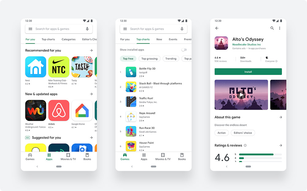
As reports in the past have hinted, Google today took the wraps off its new Play Store redesign for Android smartphones. This brings the popular Material Design UI to the app, much in line with a few other Google apps.
The update is enabled automatically and doesn’t require any elaborate download/setup. If you’re not seeing it on your devices yet, freeing the cache for Play Store through the Settings may bring about the change.
In addition to the visual refresh, this Play Store update also makes some discovery related changes, particularly with the addition of two “distinct destinations” for games and apps. Users will also find more information on the app page, and get improved suggestions for relevant apps and games. The icon shapes have been changed as well, so it’s not a small visual refresh.
Google listed the following changes with this update:
- To make browsing faster and easier, we’ve introduced a new navigation bar at the bottom of the Play Store on mobile devices and a new left navigation on tablets and Chrome OS.
- There are now two distinct destinations for games and apps, which helps us better serve users the right kind of content.
- Once users find the right app or game, the updated store listing page layout surfaces richer app information at the top of each page as well as a more prominent call-to-action button. This makes it easier for users to see the important details and make a decision to install your app.
- You’ll also notice our new icon system with a uniform shape, helping content to stand out more over UI.
Have you seen the update on your phones yet? Let us know.
Source: Android Developers Blog
Via: 9to5Google
