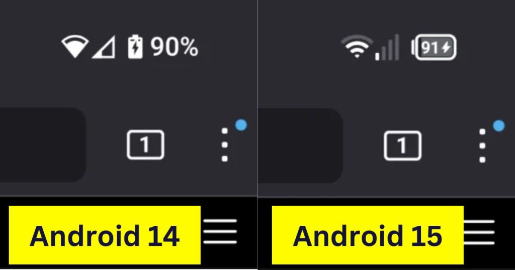
Google’s Android 15 Update Sparks Outrage Over Retro Status Bar Icons
Android users are up in arms over leaked screenshots showing Google’s planned redesign of the status bar icons in the upcoming Android 15 update. The new Wi-Fi, mobile data, and battery icons harken back to a segmented design style not seen since the early days of Android, drawing unfavorable comparisons to Chinese phone brands like Xiaomi.

The Android 15 update, currently in developer preview and slated for public beta this summer, includes subtle but significant changes to the ubiquitous status bar at the top of the screen.
The battery icon switches from a vertical to horizontal orientation, with the percentage now displayed inside the battery. The Wi-Fi and cellular signal strength indicators revert from a minimalist style to the classic stair-stepped segments.
Mishaal Rahman, a reputable tech leaker, shared screenshots of the new status bar icons enabled in a non-public build of Android 15.
While the changes are minor from a technical perspective, the aesthetic shift has struck a nerve with vocal Android fans who see it as a step backward.
Many took to Reddit’s r/pixel_phones community to express their displeasure:
“c’mon bruh can we not become Xiaomi ????” lamented one Redditor, garnering over 290 upvotes. “Dear no Google please stop no,” pleaded another.
“Google pls don’t pull an iOS in Android,” commented one user. “The current ones look soooo good and clean. What the heck Google”.
Others debated the functional merits of the redesign. “Aesthetically, I prefer the more minimal current status bar, but the new status bar has more potential to display more meaningful information while using less space,” argued one Redditor. “You’re only talking about the battery icon, right? ‘Cause the WiFi and the Mobile Data icon feels like provides the same level of information/bar and uses the same space,” countered by another user.
Some Redditors called for Google to allow customization options. “Why can’t they bring back the pre Material You (android 11) ability to select icon style!”
One user speculated that “It will probably be a customizability thing like we have with lock screen clock fonts.”
However, not everyone rejected the changes. “Didn’t it used to look like this before?”
“Yes, like 10+ years ago. I used to make icons like that on my G1,” confirmed one user, referring to one of the very first Android phones from 2008.
Surprisingly, some even welcomed Google’s retro revival. “I’ll be honest : I like this return to older styles. Its like android was From gingerbread to ICS, especially if you had an HTC device that had essentially that battery meter,”
“I have really disliked the android 5+ status bar icons. Everyone else just about forever has used discrete segmented icons and I think the fully infilled google materiel ones just look silly and are harder to differentiate.”
As the Android 15 beta approaches, Google is sure to get an earful from its most passionate users about the status bar’s new-old look. For a minor UI element, the status bar has proven that even the smallest pixels can have an outsized effect on user experience and brand perception.