Google Unveils 3D Bugdroid Head in Updated Android Logo
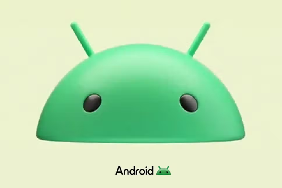
Google has subtly refreshed the model Android logo, advancing from a 2D representation to a revamped 3D version of the Bugdroid robot head.
Halfway through a second decade of expansion, the Android brand continues to evolve. This recent update is one of several throughout its existence; however, it marks a notable shift as the Bugdroid robot’s head is no longer a flat image but has adopted a fresh look with depth, light reflections, and shadows.
The previous logo was last updated four years ago when Google transitioned from displaying the whole Botdroid robot to only its head with antennas.
From CES 2023: A First Look at Google’s New Android Brand Identity
The new logo was initially observed in an Android advertisement that spotlighted Google applications on the Samsung Galaxy S23 Ultra as well as the Galaxy Z Flip 4.
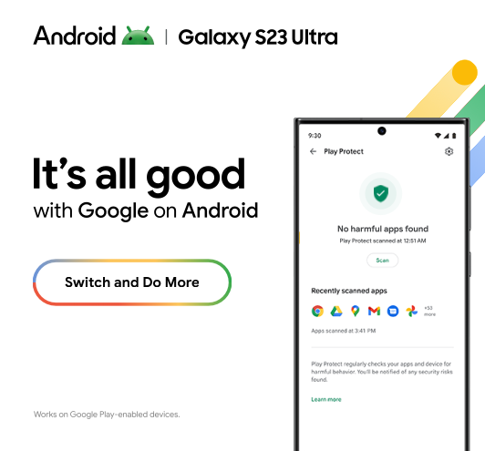
This revelation confirmed assumptions that first arose during CES 2023, where keen viewers spotted graphics amongst other campaign materials that suggested an impending brand revamp.
Official Implementation of the Revamped Android Logo
Though already being subtly inserted into various marketing materials, there hasn’t been an official rollout date disclosed by Google for this new visual identity. Once proclaimed officially, its influence is anticipated to be broad and noticeable – spanning from Android’s digital avenues, like its websites and online advertisements, to physical spaces, such as trade show signage and event artwork. All Android devices are likely to display this updated logo design on their boot screen too.
Industry insiders speculate that Android 14 could debut this new logo alongside its updated software features later this year.
The Significance of Typography: From Lowercase To Uppercase ‘A’
Another visible change comes in typography, diversifying its brand image even further. Users are accustomed to seeing Android written in all lowercase; however, this tradition has been upended.
The new typography feature includes an uppercase “A” at the start of “Android.” The font style modification reflects another subtler part of this rebranding initiative.
Looking Back: A History of Google’s Android Logo Changes
This significant update isn’t brand-new territory for Google, with periodic logo changes being somewhat of a ritual since Android’s inception. Originally introduced in 2008, the first significant shift came in 2014 when Google adjusted the color shade of Bugdroid and unveiled a new font for “Android.”
A more drastic redesign occurred in 2019 when everything other than Bugdroid’s head was removed and introduced alongside a slightly modified font.
In response to these changes, Google precisely stated:
We’re showcasing some elements of our new brand identity on various surfaces… We’ll have more to share in the coming months.
This suggests not only that these glimpses into their updated visual identity are intentional but also indicates further announcements or reveals can be expected as we progress through the year.
#